
Unarguably a good glass of wine is simply a delight. From a humble grape to a glass, there is a story behind the journey of every glass of wine we consume. Just like the unique stories behind a glass of wine, here we unveil the wonderful story behind the logos of Bottli and eBottli, two brand names that you could associate with wine. The face behind the brands, Nathalie Taquet established both Bottli and eBottli with the aim of protecting the wine industry from the trade of counterfeit wine and to encourage the trade of genuine quality wine. The main objective behind Bottli is to connect wine manufacturers with consumers; it focuses more on establishing a better business to consumer bond. eBottli focuses more on building a stable business to business connection by helping wine manufactures secure their brand and cashflow digitally through the use of modern technology solutions to guarantee the wine provenance from the harvest to consumer. Hence, there is a unique story behind the two brands and their logos.
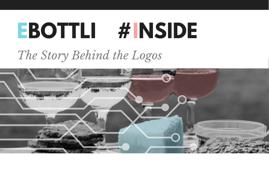
Use of colour and shape is the same for both Bottli and eBottli logos. Just by looking at the logos, one would say that it takes an oval shape, however, if you look closer, it is not just a shape but a shape of a glass of wine and to be more specific, the inspiration behind the shape of the logos has come from a balloon glass. Wine cannot be tasted from just any shape of glass and a balloon glass takes a special place especially for red wine. Well, you may ask “but why a balloon glass for the logos?” A balloon glass is designed with a balloon-shaped bowl for large pours but specially to let your wine breathe as it exposes wine to the air which allows ethanol to evaporate and then allows the softening of tannins. Overall, the glass has been designed in a way that enables the consumer to enjoy every drop of a quality wine by protecting and enhancing each element. Hence the meaning of a balloon glass pairs with the philosophy behind the two brands which is to ensure the quality of each bottle of wine delivered to consumers.
Within the balloon-shaped glass of the logos is a splash of pink and blue with a hint of white. These are not merely three different colours. The meaning behind the use of pink, blue and white is quite significant and relates to the inception of the two brands The business was first born in France which is the homeland of the founder, Nathalie. She got her inspiration for both brands through her family-owned winery situated in Burgundy. The inspiration was then brought to Australia, crossing oceans. Therefore, the three colours in the logos signify the colour combination of the flags of both France and Australia. Moreover, the inspiration for the colours also come from the colour of water and the colour of the wine. Water is represented by the colour blue whilst wine is represented by the colour pink. Water has been an essential part of the everyday life of humans and so it is in manufacturing wine. Since the inception of the wine trade around the world, water has been the main source of transportation as the barrels and bottles of wine were transported by ships through seawater from one country to another. Moreover, in the process of manufacturing wine, water is one of the major components, making up approximately 85% of the volume, hence, the the use of the colour blue for both Bottli and eBottli logos to reflect this meaningful correlation. When distinguishing the logos of Bottli and eBottli, the glass with lines connected to each other of the eBottli logo represents how the brand uses modern technology to digitise the wine authentication process to protect wine brands and on the other hand, the Bottli logo has a filled glass of wine to represent its objective of connecting wine sellers with consumers to deliver bottles filled with quality wine.
So, this is the humble yet beautiful story behind the logos.